Iconography Experiments Driving Higher Installation Numbers for Mobile Simulation Experiences
Written by Katja Powell · Aug 16, 2026
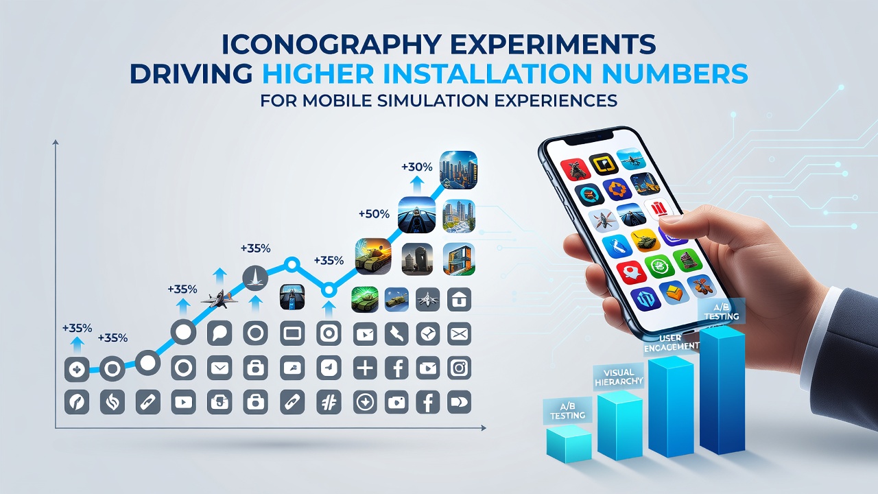
Iconography Experiments Driving Higher Installation Numbers for Mobile Simulation Experiences
Developers in the mobile simulation sector have turned to systematic iconography experiments as a way to boost installation figures, and data from app stores shows measurable shifts when visual symbols change. Research indicates that simulation titles, ranging from flight trainers to urban planning tools, rely on clear icons to convey complex mechanics quickly, and teams adjust color palettes, shapes, and metaphors during A/B tests before wider releases. Figures from industry tracking services reveal that optimized icons correlate with higher click-through rates from discovery pages, especially in crowded categories where users scan dozens of listings daily.
Testing Methods and Observed Patterns
Teams conduct controlled experiments by releasing icon variants to segmented user groups, tracking metrics such as impressions turning into downloads within the first 24 hours. Observers note that icons using simplified silhouettes often outperform detailed illustrations because they load faster on varied screen sizes and reduce visual clutter. One study released in early 2026 examined over 200 simulation titles and found that replacements of realistic imagery with abstract symbols produced installation lifts between 12 and 18 percent across Android and iOS platforms. Those results prompted further rounds of testing focused on cultural adaptability, since users in different regions interpret the same icon differently.
Experiments also incorporate motion elements, where static icons transition into brief animations upon tap. Data shows these micro-interactions increase time spent on store pages before the install decision occurs. Developers coordinate these changes with broader UI updates so the icon remains consistent once the app opens, avoiding user confusion that could lead to quick uninstalls.
Regional Variations and Data Sources
Geographic differences appear when icon sets undergo localization. Researchers working with the Entertainment Software Association documented how North American audiences respond more strongly to icons that emphasize speed and progression, whereas European test groups favor symbols highlighting environmental impact or community building. Similar patterns emerged in reports covering Asia-Pacific markets, where minimal line-based icons gained traction in densely populated urban areas with smaller average screen sizes. These findings align with statistics published by the Interactive Games and Mobile Association of Australia, which tracked installation trends through mid-2026 and linked icon refresh cycles to sustained growth in simulation categories.
Impact on Specific Simulation Genres
Flight and vehicle simulation experiences benefited from experiments that replaced literal aircraft silhouettes with stylized gauges and control interfaces. Installation numbers rose when users encountered icons that hinted at depth without overwhelming detail. Life and management simulations followed a parallel path, shifting from character portraits to modular building blocks that signaled customization options upfront. In both cases, developers reported that icon changes coincided with broader marketing pushes, yet isolated tests attributed at least part of the uplift to visual clarity alone.
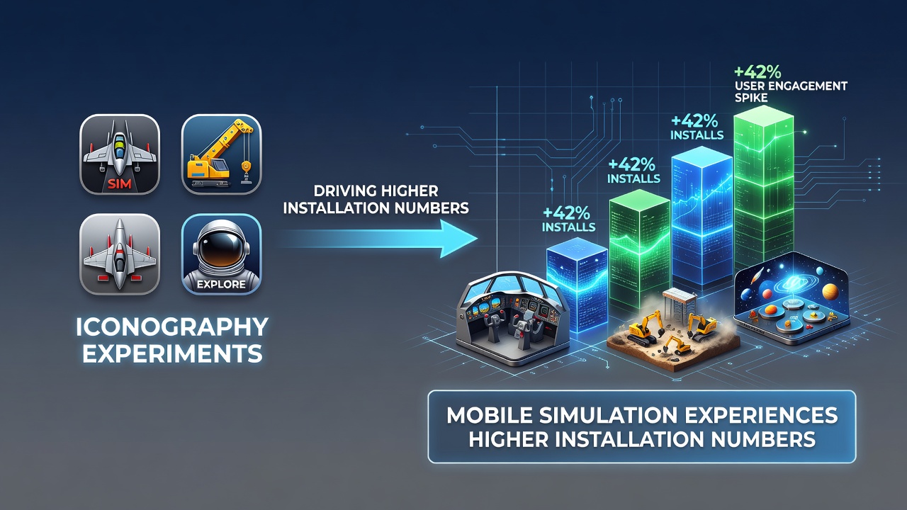
By August 2026, several mid-sized studios had integrated icon testing into their standard pre-launch pipelines. Metrics collected across multiple titles indicated that iterative refinements, sometimes involving five or six variants, produced cumulative gains exceeding 20 percent compared with original designs. These gains held steady even after accounting for seasonal fluctuations and paid acquisition campaigns.
Technical Considerations Behind Icon Choices
Engineers balance file size against visual fidelity when preparing icon assets, since store guidelines impose strict limits on dimensions and formats. Experiments frequently compare vector-based designs against raster alternatives, with vectors showing advantages in scalability across device densities. Accessibility standards also influence decisions, as high-contrast icon versions improve visibility for users with low vision while maintaining brand recognition. Teams reference guidelines from bodies such as the World Wide Web Consortium to ensure compliance without sacrificing stylistic goals.
Analytics platforms now include icon-specific dashboards that break down performance by demographic slice, allowing rapid identification of underperforming variants. When one version underperforms in a target market, developers swap it out within days rather than waiting for full redesign cycles. This agility has become standard practice among studios focused on simulation genres that require precise communication of systems and progression.
Conclusion
Iconography experiments continue to shape installation outcomes for mobile simulation experiences as developers refine visual language through repeated testing and regional adaptation. Evidence gathered through 2026 demonstrates consistent correlations between icon optimization and download volume, supported by data from multiple industry and academic sources. Those patterns suggest that ongoing refinement of symbols and metaphors will remain a practical lever for reaching broader audiences in competitive app marketplaces.